

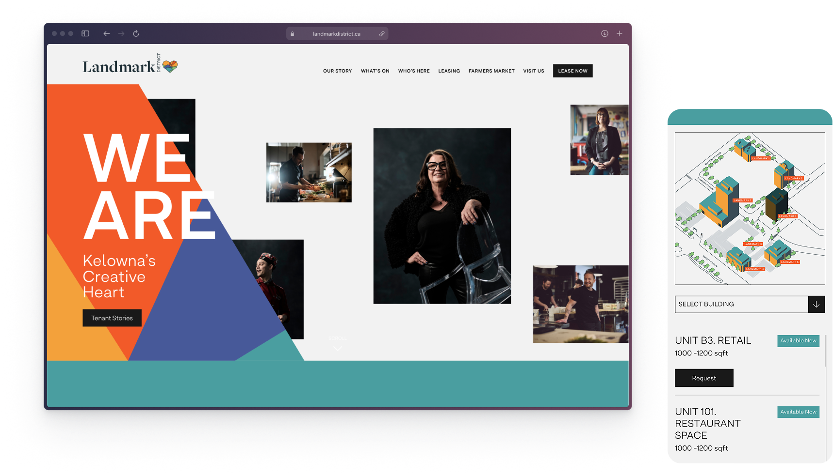
The central digital touchpoint for a creative hub and business centre in downtown Kelowna with over one million square feet of retail, dining and office space.
 Design System
 UX | UI
 CMS
CMS Figma
Figma Illustrator
 Photoshop
I led the product and UX/UI design and ran QA through launch, working with a creative director, a development team and a marketing team.
A responsive CMS-backed website built as the district's primary digital touchpoint and shipped in phases.
The Problem
Landmark District was rebranding from the Kelowna Business Centre into a home for creative and progressive professionals. The website had to carry that repositioning as the central touchpoint for three audiences who each wanted something different from it. The district needed to picture itself leasing spaces. Visitors needed a reason to show up. Existing tenants and the wider community needed a current and credible front for the district.
The obvious move was to migrate the old content under the new brand. A heuristic evaluation of the existing site made it clear that this would not be enough. The structure and usability problems sat underneath the brand, not on top of it, so a new look alone would carry them straight into the relaunch.
That reframed the brief. The question was not how to make the site look new. It was how to make Landmark District a place people want to be part of, and how to turn that into something measurable. I treated two outcomes as the real targets. Conversion, meaning the district moving from browsing to enquiring about space. And visibility, meaning more people finding the district and engaging with what happens there.
The Outcome
Flattening the navigation, restructuring the content and building on a flexible design system gave the district a site that matched how people moved through it rather than how the old structure was organized. The leasing path got shorter and the directory easier to search, and the client had a front that could stay current as it grew. In the two weeks after launch, users rose 120 percent on desktop and 87 percent on mobile over the prior period.
Approach
Designing within the timeline
The timeline was tight, so I planned the product in phases rather than trying to ship everything at once. The sorting rule was the brief itself. Anything that directly served finding a space, finding a business or finding something to attend went into phase one. Everything else waited. This kept the launch focused on the surfaces that actually drove conversion and visibility.
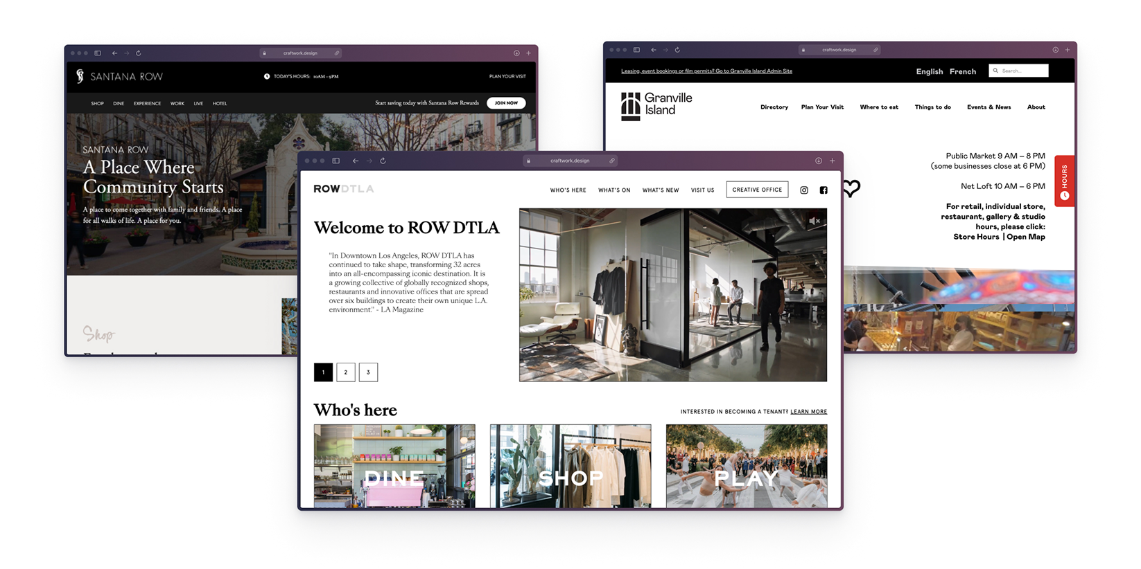
Competitive analysis
To ground the project, I started with a competitive analysis of similar hubs across North America. Studying these platforms provided valuable insights into successful strategies and best practices that could elevate the Landmark District's digital appeal and functionality.
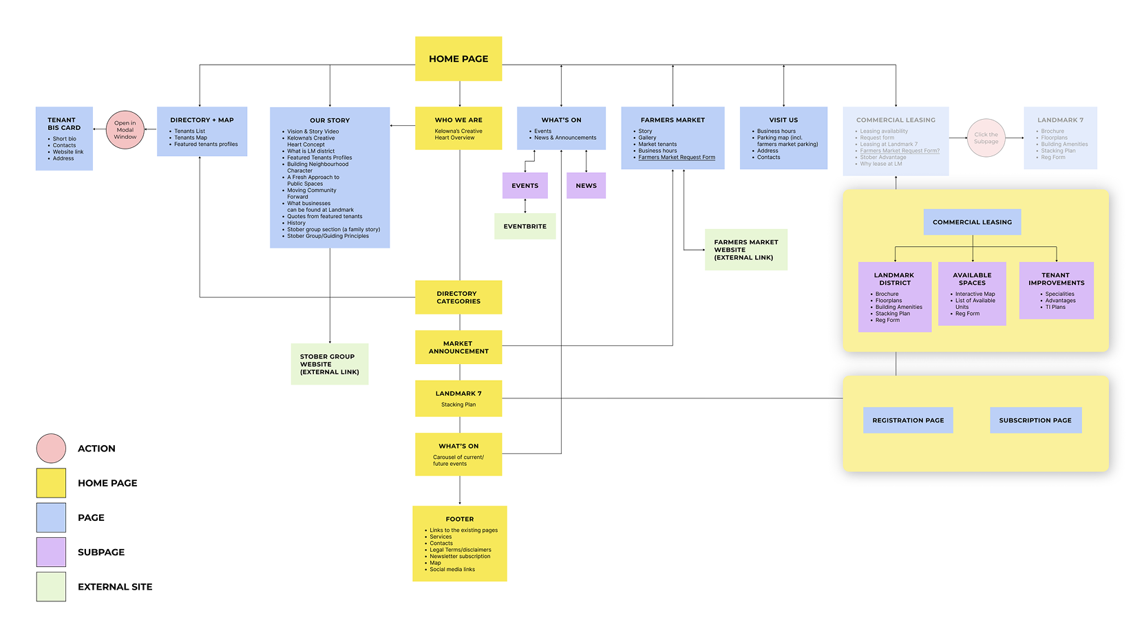
I focused on refining the informational architecture. Users needed a more efficient, logical way to navigate the site's content.
I adjusted the tone of the language to better connect with our target audience, strengthening the focus on the vibrant community within the district.
Process
Flattening the structure so the menu did the work
The previous site buried content in a deep structure. I moved it to a flatter organization so people could reach what they needed in fewer steps. I consolidated News and Events under a single What's On item, and split the dense commercial leasing area into three focused subpages for space search, tenant improvements and the newest building. Reducing the number of top-level items let the main menu stay fully visible, which meant I could avoid a hamburger menu on desktop and keep navigation in plain sight.
Making the directory findable
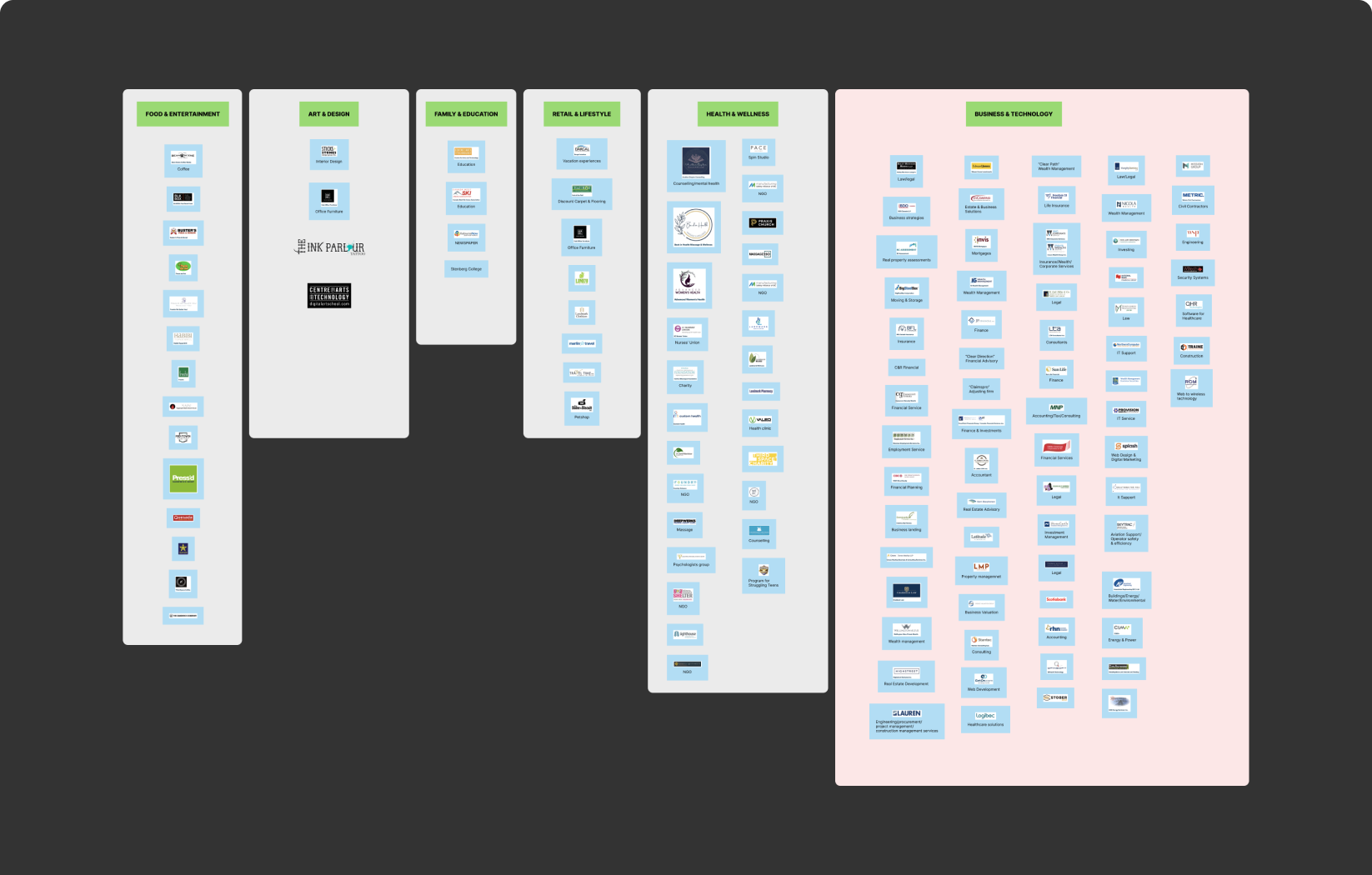
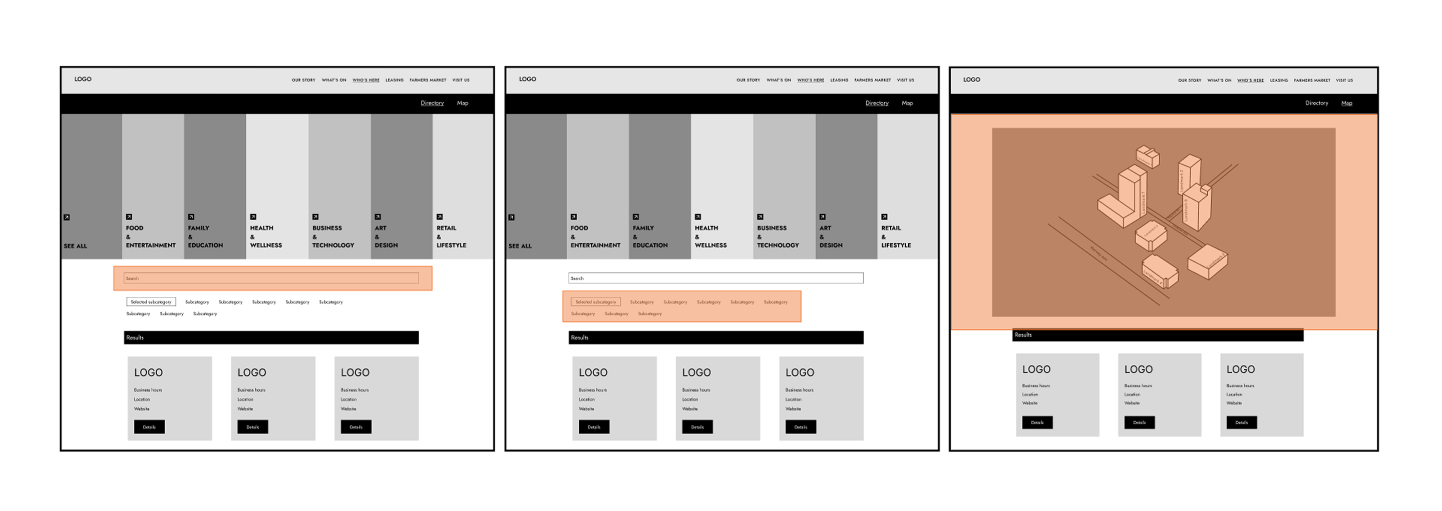
The directory was where prospective customers and businesses found who was already in the district. The old approach sorted tenants by business type into more than sixteen categories, which forced people to scroll through a long list and miss things. I ran three rounds of card sorting to find a structure that held, and landed on a two-level filter that narrows the search gradually instead of presenting everything at once. I tested naming the categories as call-to-action verbs, but that created ambiguity, so I kept the labels plain and literal to give people a clear sense of where each path led.
Cutting scope in wireframes
I ran the first wireframes and low-fidelity prototype with the development team and the client, which let me estimate honestly what phase one could hold. That review is where the heavier search and filtering moved to phase two, a call I would rather make in wireframes than after launch.
Turning available spaces into a leasing tool
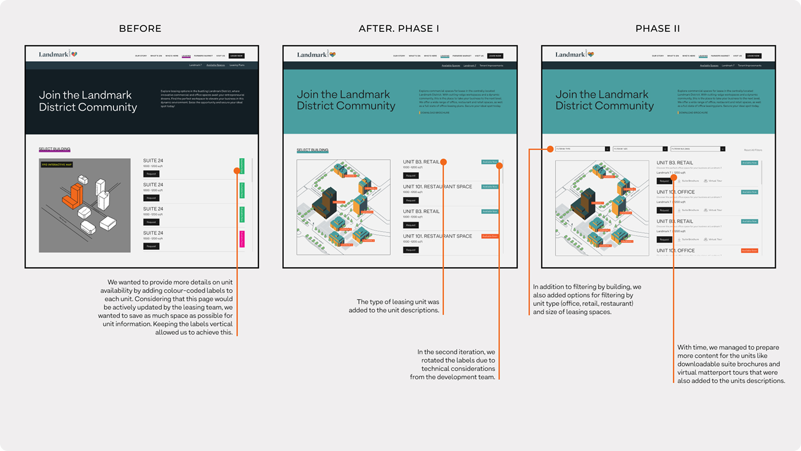
The available spaces page was the closest thing the site had to a sales surface, so I designed it as a tool rather than a list. The original version listed every unit across the seven buildings in one long run with no way to narrow it down, so anyone hunting for a particular type or size of space had to read through all of it. I replaced that with an interactive map that let people select a building and see what was open inside it, with the unit details they needed to decide whether to enquire.
Making the businesses discoverability faster
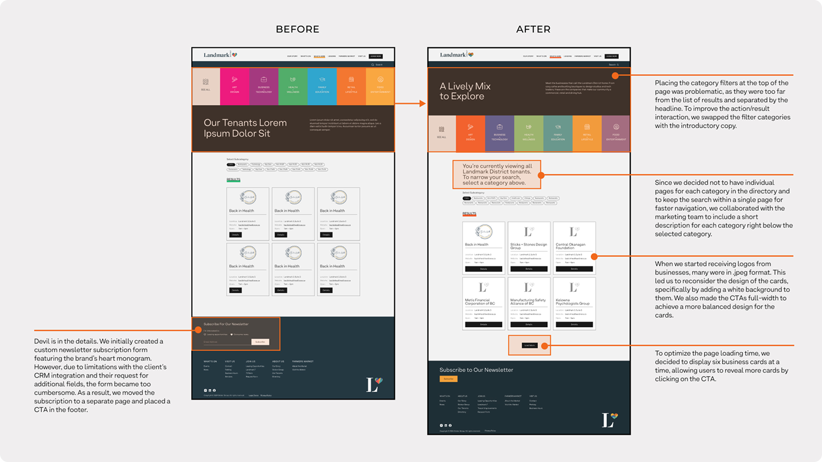
Refining the directory was where competing priorities had to be ranked rather than balanced. The page had to hold clear navigation, the marketing team's introductory copy for the page and each category, and the brand look, and I settled the trade-offs in that order, usability first, then business and marketing goals, then visual aesthetics. The category filters had sat at the top of the page, too far from the results and split off by the headline, so I moved them down beside the list to tighten the loop between picking a category and seeing what it returned. Keeping the whole directory on a single page rather than breaking each category onto its own like it was before kept the search quick, and a short description under the selected category oriented people without an extra click.
Final Thoughts
A brief like boost conversion and visibility is most useful as a sorting function. Treating it that way gave me a clear test for every scope decision under a tight timeline. If a feature directly helped someone find a space, find a business or find an event, it earned a place in phase one. If it did not, it could wait without hurting the launch. The discipline was not in adding more but in knowing what the product could ship without.