

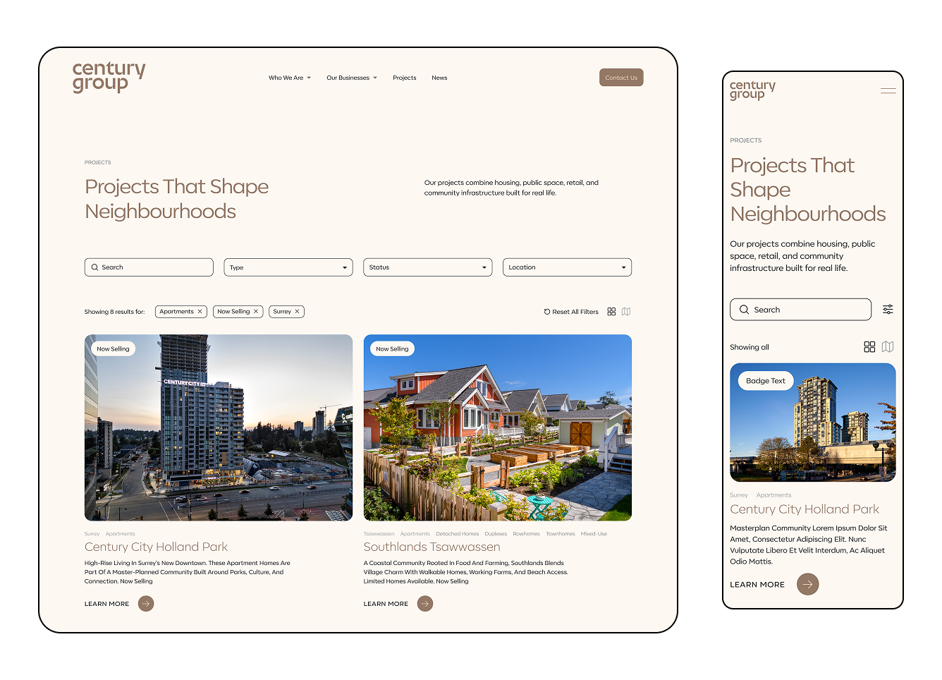
Building a scalable design system for a multidivisional real-estate developer
 Design System
 UX | UI
 CMS
CMS Figma
Figma Illustrator
 Photoshop
 Claude
Design system lead. I owned the component architecture, the brand application across the site, the responsive behaviour, and the token pipeline.
A centralized design system that gives Century Group one foundation to scale their portfolio and business verticals on.
The Context
Century Group is a multidivisional real estate developer. The portfolio was growing across businesses and projects, but the digital foundation had been built one screen at a time, with no shared base. As the company grew, the existing digital infrastructure struggled to adapt.
The brand drifted. Without a single source of truth, the site grew visually and functionally inconsistent, which affected the brand presence and user experience.
Lack of scalability. Every new property type or vertical meant breaking layouts and heavy dev work, so getting new pages or sections live took longer than the business wanted.
No reusable components. The absence of reusable, modular components slowed time to market for new projects and made global updates hard to execute cleanly.
Building a Scalable System
Less is more. Bringing structure and hierarchy to the website.
One of the first steps toward a scalable system was deciding which elements to consolidate, which to add to the new site, and which to retire.
I started with the button styles and introduced three main types. The Primary button carries the main CTA on a page. Secondary buttons move the user to the next page, step, or action. The Tertiary button sits on image cards and smaller actions further down the hierarchy.
That replaced the one-off button approach the site had before and gave us a consistent navigation system.
The component library grew further once I added other interactive UI elements such as dropdowns, filtering chips, and icon buttons. These gave the product a full set of interactive parts to use across the website.
Cards: one structure, any data
With the cards, I found that their variety in the old design was driven by content. News cards, project cards, approach cards, and business cards all carried different fields. I broke the existing cards down to their common denominators and built a small suite that holds a strict underlying grid no matter what data gets plugged in.
Where did AI help the most
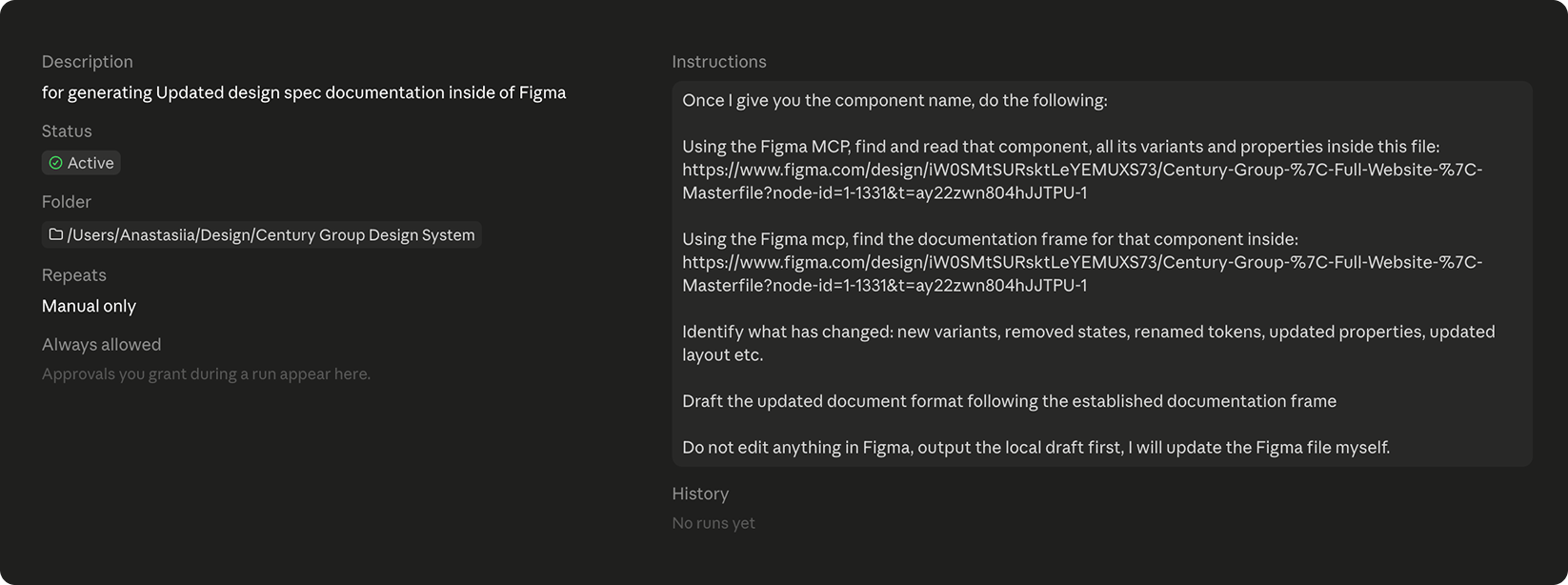
A substantial design system isn't complete without a clear guideline for using it. That was where I brought Claude Code into the process. To document my component library from scratch, I built a Component-Spec Skill that guided Claude through reading Figma components and writing the finished documentation into the file.
The result gave me a solid starting point. I still had to remove the irrelevant and repetitive specifications Claude produced and shape the document around my library, but it saved hours of work up front.
Documentation is ready, what's next?
A design system is a fluid construct that shifts and evolves over time. Every one of those changes has to reach the documentation, which is the area design teams overlook the most. To keep the documentation current, I set up a specific Routine inside Claude Code that runs each time the design system changes.
This kept a mundane but necessary part of the process running in the background, with supervision.
Colour as the wayfinding system
The real challenge arrived with the brand handoff. It came with a large, highly vibrant colour palette that had to stand in as the new Century Group identity. Paired with the goal of a clean corporate look, balancing that palette became the hard part.
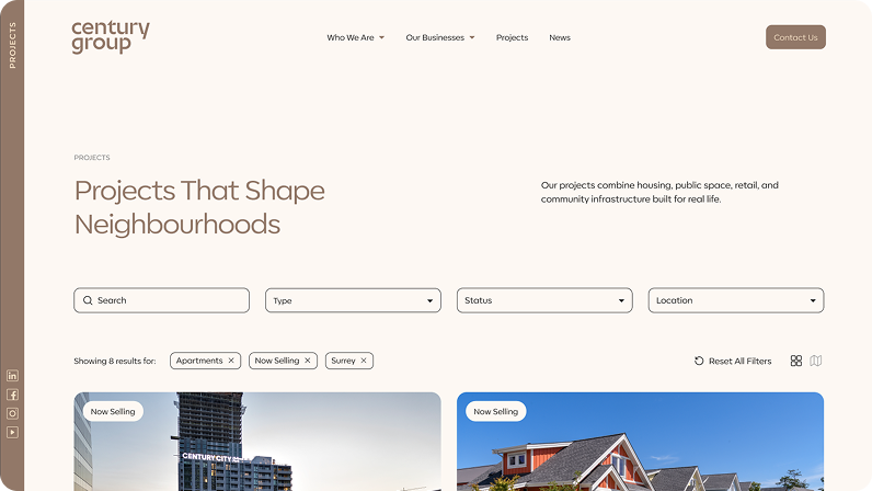
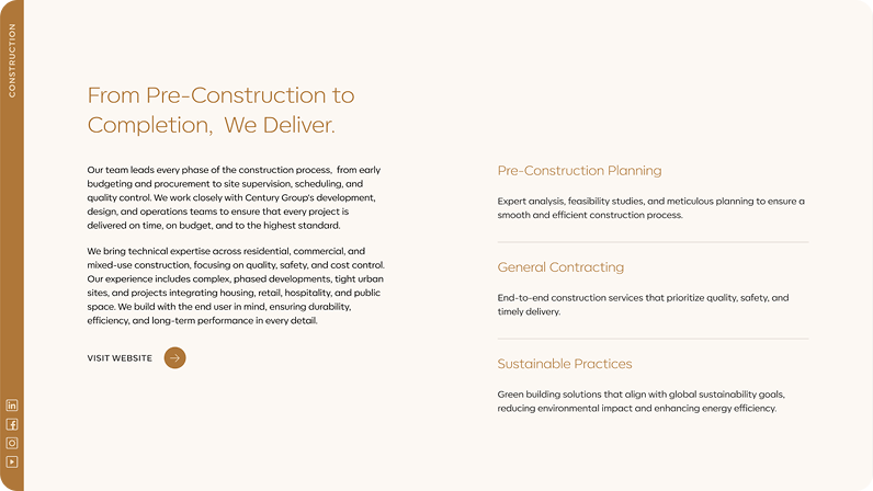
Instead of treating the palette as decoration, I gave it a job. I assigned one anchor colour to each major section of the site — Main, Businesses, Projects, and About — and used it as a functional wayfinding system. As users move through the site, the subtle colour shift acts as a quiet anchor that tells them where they are.
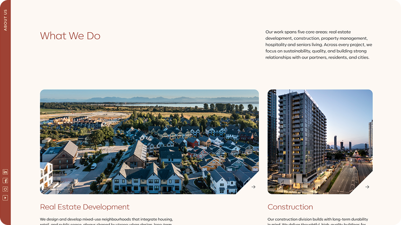
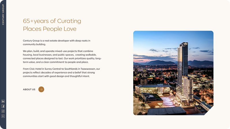
Tradeoffs I had to make around this decision
One was accessibility, specifically how colourblind users rely on the navigation. So the wayfinding colour always rides alongside a redundant cue such as the location label.
The other obstacle was that the UI elements had to be adapted for each colour scheme, which in this case meant four separate themes. This was where I had to revisit the wayfinding approach and discuss a single-theme design with the client. A one-theme route would have been simpler, but the colour differentiation wasn't something the client wanted to give up.
The engine: tokens that cascade
The wayfinding logic could only scale if it was wired to tokens. Hard-coded values would have become a nightmare in the shipping phase, so I built the whole system around something the design and dev teams could share.
The system consists of four main Variable Collections:
Brand. This collection lists the primitive tokens such as colour hexes, typefaces and their variations, and the base scale.
Alias. This group sets out the general roles and intent of the brand primitives, including error, information, primary, secondary, and thematic colours.
Mapped. These tokens are the ones assigned to the components. Here I tied the alias roles to the specific scenarios where each token should be used.
Responsive. This collection carries all the typographic values across desktop, tablet, and mobile viewports.
With this setup the design team can update any value in minutes instead of changing it in every instance.
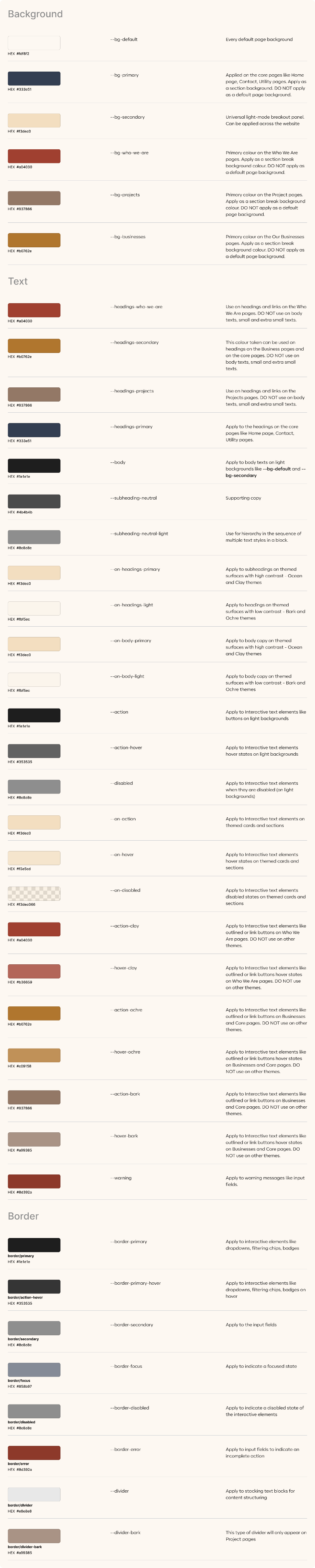
For the dev handoff, the Mapped and Responsive collections were set to be exported to TypeScript and placed on GitHub for the developers to pick up and maintain. Our internal team had never worked this way before, since past projects used much simpler libraries, and bringing this method into our process was my initiative to reduce friction between the teams. Everything was ready to run this way when, at the very last minute, I had to quietly hand the design off to a vendor and had little chance to work with them on any new workflows.
What we achieved in this redesign session
Built a scalable design system that the Century Group team can now adapt for their growing portfolio.
Consolidated at least 10 ad-hoc elements like cards and button styles into a set of token-driven and hierarchy-structured components spanning all states.
The system now absorbs 5 business verticals and 11 projects without a redesign — directly addressing the scalability gap.
Global brand or colour changes that were previously hours of manual edits now cascade from a single token in a few minutes.
Tokenized system bridged the gap between design and engineering, significantly reducing friction and handoff time between the teams.
Reflections
Next time I'd validate the wayfinding idea with users. The logic held up on paper and had clear design reasoning behind it, but a quick unmoderated test would have either confirmed the anchor effect or shown me the cue needed to be more explicit.
I'd also rework the token setup to cut down the number of mapped tokens. Right now the mapped collection holds a separate value for the buttons in each theme. I'd treat the four colour schemes as themes and split them one tier earlier by using modes in Figma variables. That would collapse four tokens into one, so --surface-button-ochre, --surface-button-clay, --surface-button-ocean, and --surface-button-bark all become --surface-button.