
Designing a multi-platform digital experience for Aviary Living
 Touchscreen App
 UX | UI
 Figma
Figma Sketch
 Illustrator
 Photoshop
I owned the product and interaction design while a development team built the front end and a brand team supplied the identity.
Multiplatform user experience design across a responsive web app and an interactive sales gallery touchscreen.
The Context
Aviary needed two digital products at once, and they could not behave the same way.
The web app was something people would meet on their own devices, leaning in to read about the lifestyle and the community at their own pace. The touchscreen was a physical product, a large interactive kiosk recessed into a wall of the sales gallery, where prospective buyers would walk up and explore floorplans, the site plan, features, and the surrounding neighbourhood in a few quick minutes.
The Constraint that Shaped the Approach
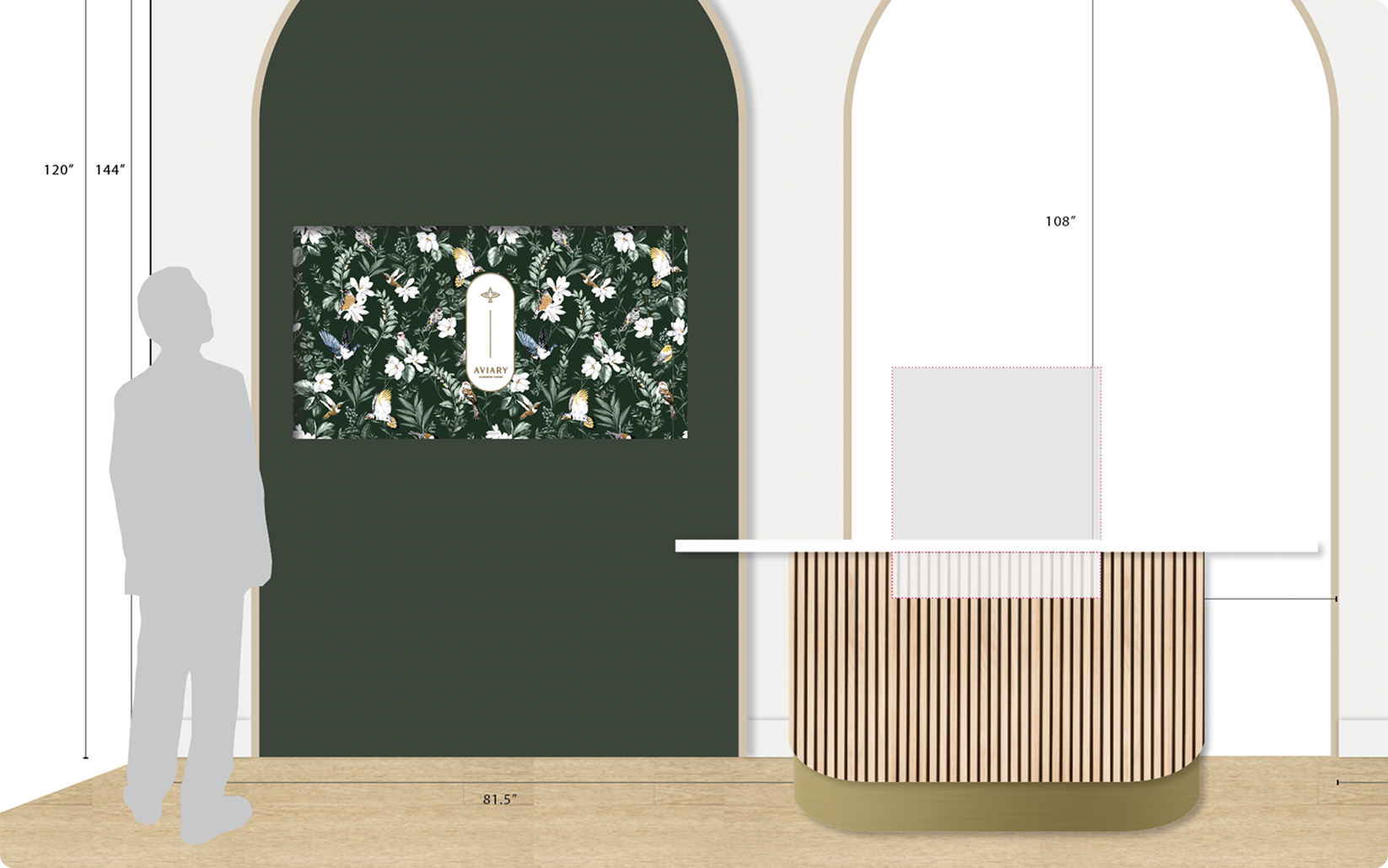
I designed the touchscreen without ever touching the hardware. The unit was not available during the design phase, so there was no way to stand in front of it, reach for a control, or sense the comfortable zones.
So I built the next best thing. I taped the full outline of the screen onto the wall at its planned mounting height and stood in front of it. How high the top edge sat, how far the reach ran across, and what a shorter or seated visitor could comfortably touch stopped being guesses and became things we could feel.
The Process
Reading the room before the screen
Before laying out a single frame, I gathered the physical specifications of where the kiosk would live. I established the mounting height, how deeply the unit would sit recessed into the wall, and the lighting conditions of the space, including how close it sat to windows that could throw glare and reflection across the display.
Designing the navigation around reach
The navigation went through several iterations, and each one failed for a reason rooted in the body rather than the screen.
The first version used a dropdown for the primary menu to conserve space, with a secondary navigation across the top, borrowing a familiar desktop pattern. It looked clean, but a menu placed that high sits out of reach for shorter visitors and anyone seated, so it failed on reach.
The second version moved the secondary navigation to the bottom to bring it within reach of everyone. That solved height, but it collided with the hardware. Because the unit was recessed rather than surface mounted, the lip of the wall sat in front of the lower edge of the screen, physically blocking any control placed there.
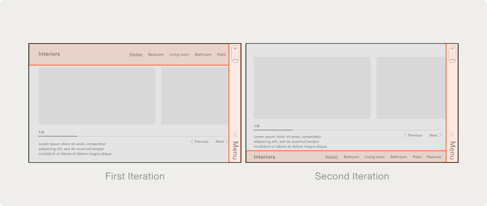
The final version resolved both problems at once. I consolidated the primary and secondary navigation into a single vertical menu anchored to the right of the screen, in the band that stays within comfortable reach regardless of a visitor's height and clear of the recessed wall edge. One stable, reachable navigation system replaced two competing ones.
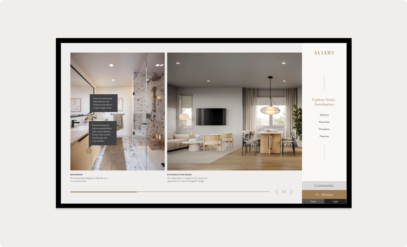
The same assets, reauthored for each screen
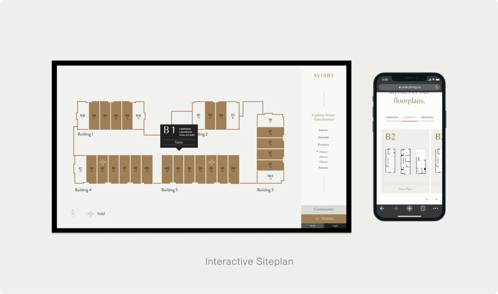
The web app and the touchscreen drew on the same set of assets. I knew from the start that a layout built for a screen you walk up to would never be the right answer on one you hold in your hand, and that was the interesting part of the work. The same maps, floorplans, and components had to be reauthored rather than resized, so each feature suited the way its screen is actually used.
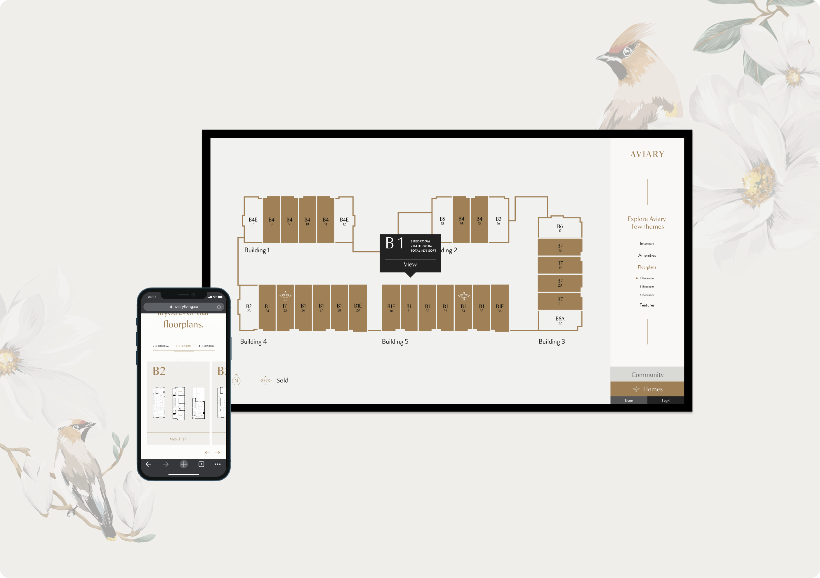
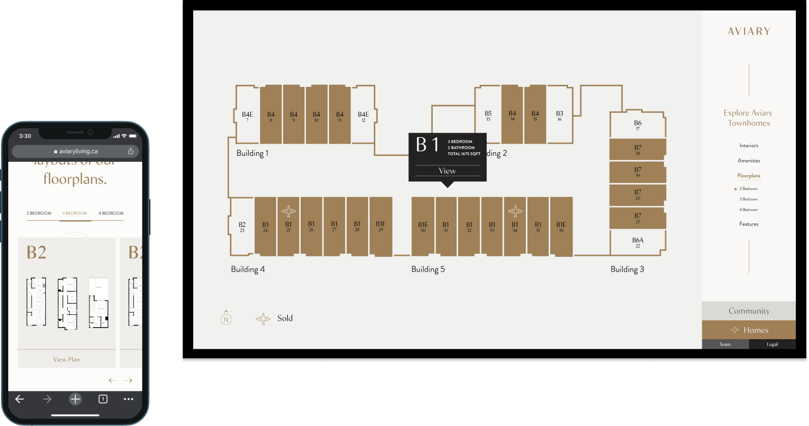
The interactive map for selecting units was a centrepiece on the kiosk, where the large display gave it room to breathe, and it worked just as well on the desktop web view. On a narrow, vertical phone screen it did not. There the same map became cramped and awkward to operate, so on mobile I moved to a carousel of unit floorplans that a thumb could move through comfortably.
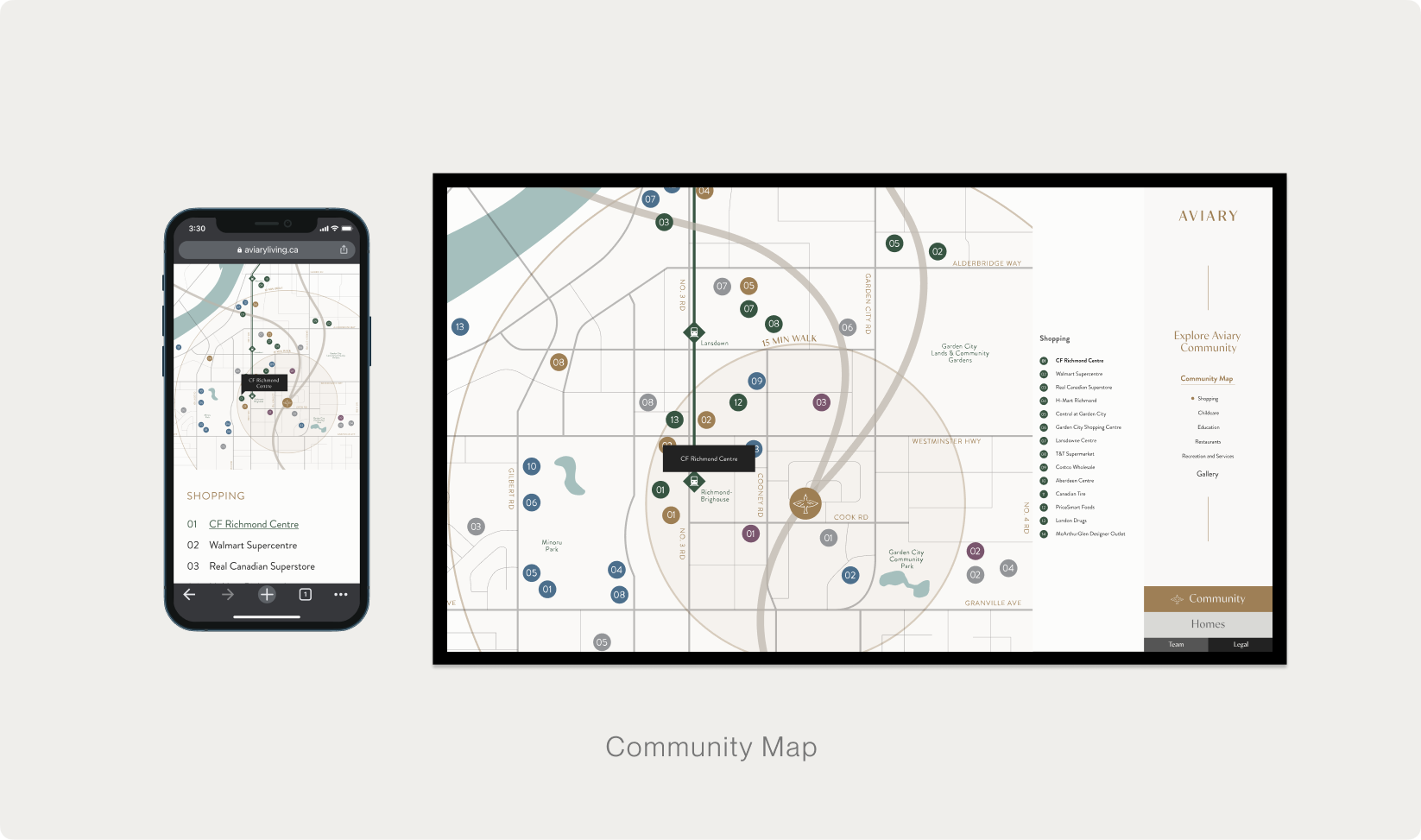
The community map followed the same logic in reverse. On the large kiosk, points of interest risked sitting too high to reach and the underlying material was hard to parse at a glance, so I paired the map with an interactive list that kept every destination accessible within the reachable zone. On mobile, where the constraint was small targets rather than height, I leaned on tappable markers sized for a fingertip.
Final Product
The real test came at launch, the first time anyone stood in front of the finished unit. The design held. Every call I had made from a taped outline on a wall — the menu on the right, the reachable zones, the reauthored maps — worked on hardware. The kiosk did its job in the sales gallery, and Aviary went on to be named a finalist for Best Project Identity at the Georgie Awards.
Reflections
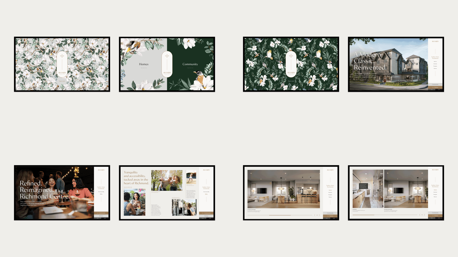
If I designed Aviary again, I would treat the touchscreen as an extension of the whole presentation centre rather than a single place where a visitor explores everything. The first version tried to do both jobs at once, carrying the lifestyle story alongside the floorplans and the map.
The centre already tells that story, and tells it better than a screen can. Its walls carry lifestyle imagery of the community and interior renders. The touchscreen does not need to repeat any of it. So I would push the storytelling to the background and make the kiosk a purely functional engine, with floorplan browsing and the interactive map as its entire purpose, the two things a visitor cannot get just by looking around the room.
The second change is about proportion. Designing a large touchscreen on a fifteen inch laptop is quietly misleading. Imagery that looks right on the laptop can turn out so large on the installed screen that a visitor has to step back to take it in, and type that reads cleanly at desk distance can be too thin to hold up on a lower resolution touchscreen. Testing on the actual hardware is ideal, but when that is not possible, printing the interface at full size and standing in front of it catches most of these problems before they ship.